Friday, September 23, 2011
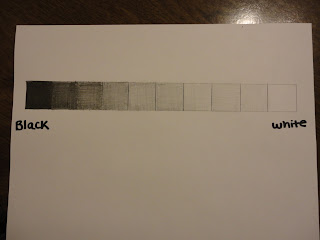
Color Wheel and Value Scale
2. I enjoyed working with the acrylic paint the best because it was more creative and I haven't played with paint in a while so it was fun.
3. My most important discovery while doing the images were that cross hatching and shading are very time consuming in a value scale and it is difficult to get the lighter images with using the same media.
4. The most important information I learned from the project was that the actually primary colors are Cyan, Magenta, and Yellow, when we were always taught they were red, blue and yellow. The videos were very self explainatory and mostly common sense.
Subscribe to:
Post Comments (Atom)


No comments:
Post a Comment